Southern Glazer’s Wine & Spirits

Southern Glazer’s Wine & Spirits

The Drop

The Drop

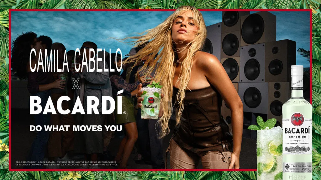
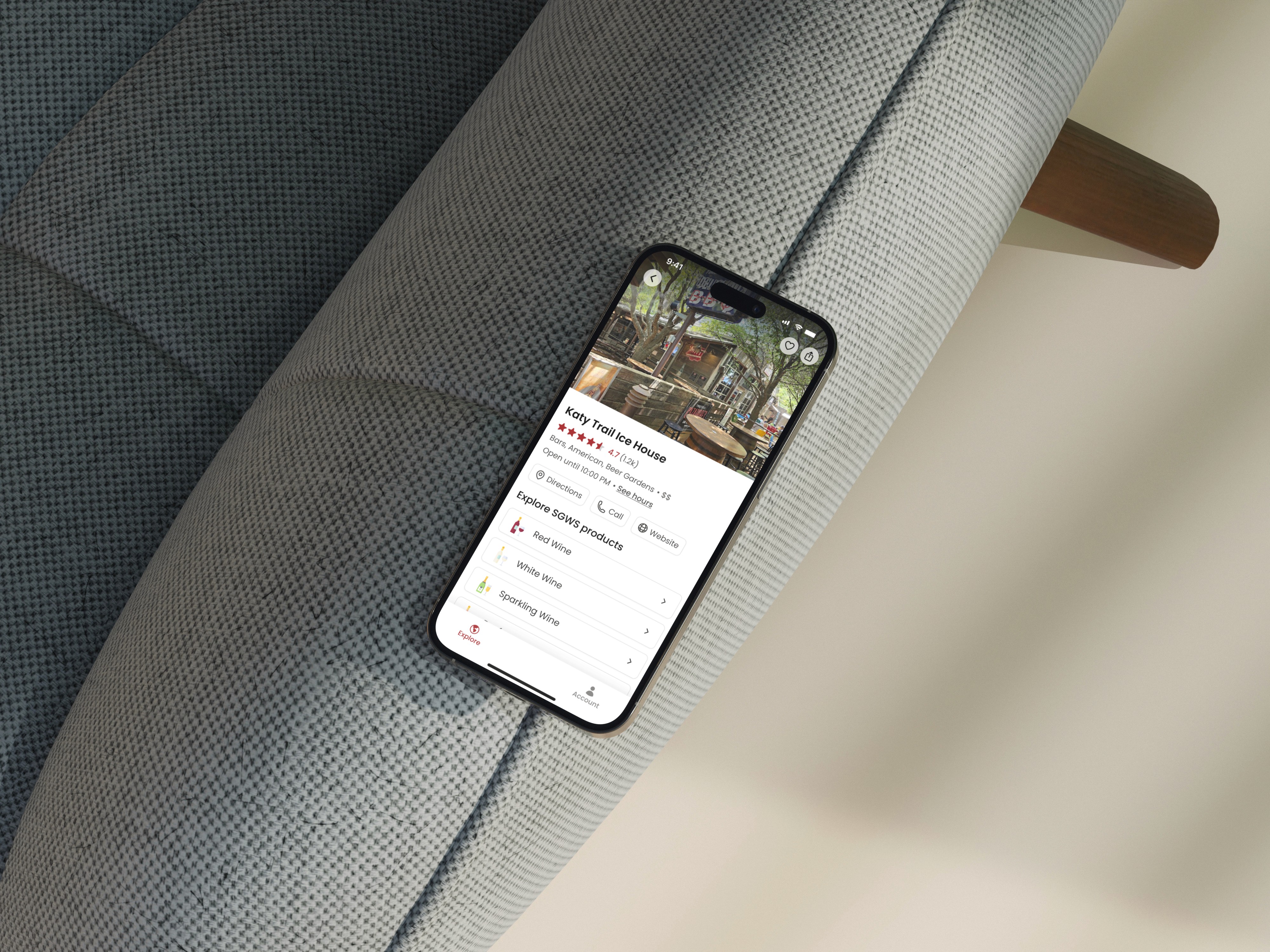
Brand partners were investing in major launches, but ads on Proof could only announce them. The Drop gave business customers a richer destination to explore new products, collaborations, tasting notes, and recipes.

Brand partners were investing in major launches, but ads on Proof could only announce them. The Drop gave business customers a richer destination to explore new products, collaborations, tasting notes, and recipes.

Role

Product Designer, working alongside my design manager in a two-person team

Product Designer, working alongside my design manager in a two-person team

Scope

Concept strategy, feed and interaction design, visual theme system, pitch, and handoff

Concept strategy, feed and interaction design, visual theme system, pitch, and handoff

Audeience

National retailers, independent liquor stores, and bars

National retailers, independent liquor stores, and bars

Outcome

Approved by leadership, launched by marketing and used for multiple drops

Approved by leadership, launched by marketing and used for multiple drops

01

Overview

Proof is Southern Glazer’s B2B e-commerce platform, used by national retailers, independent liquor stores, and bars to order products. Brand partners wanted more space to tell the story behind new releases than a banner advertisement could provide.

Proof is Southern Glazer’s B2B e-commerce platform, used by national retailers, independent liquor stores, and bars to order products. Brand partners wanted more space to tell the story behind new releases than a banner advertisement could provide.

The Drop created a richer destination after the click. Over three months, I worked alongside my design manager and led the concept strategy, visual and interaction design, pitch materials, and handoff system. Leadership approved the concept, and marketing used it to launch multiple Drops.

The Drop created a richer destination after the click. Over three months, I worked alongside my design manager and led the concept strategy, visual and interaction design, pitch materials, and handoff system. Leadership approved the concept, and marketing used it to launch multiple Drops.

02

Problem

The ad got the click. The product needed a story.

The ad got the click. The product needed a story.

Brand partners were treating product launches as major events, investing in original photography, video, and celebrity collaborations. Proof’s standard banner placements could attract attention, but they had little space to explain the product or make use of those assets once a buyer clicked.

The solution also needed to scale. Building a completely custom page for every launch would create a slow and expensive process. We needed a repeatable experience that helped buyers understand each release while giving every brand room to look and feel distinct.

03

DEFINING THE EXPERIENCE

Exploring possibilities building a foundation

Exploring possibilities building a foundation

My design director and I worked through a range of design exercises to explore what a Drop could become. We generated ideas through quick sketches, gathered inspiration from other experiences, and mapped out a page layout with labels for the content and features we wanted to include. Together, these exercises helped us align on priorities and give the experience a clearer structure.

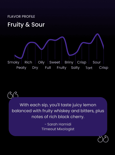
We also explored key features in more depth, including how a match score could help buyers understand how a product might fit their tastes. Moving between broad ideas and focused explorations helped us build a shared foundation for the page structure, content, and visual design that followed.

04

Explorations

Testing the experience of a product's story

Testing the experience of a product's story

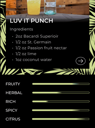
My exploration covered the full journey: how buyers would discover launches in the feed, which interactions could make releases feel timely, how tasting notes and recipes could make product information easier to understand, and how each brand could carry its own visual theme. This helped us define the experience as one system with two layers: a consistent feed for discovery and a flexible page template for each Drop.

05

The feed

A feed built around what was happening now

A feed built around what was happening now

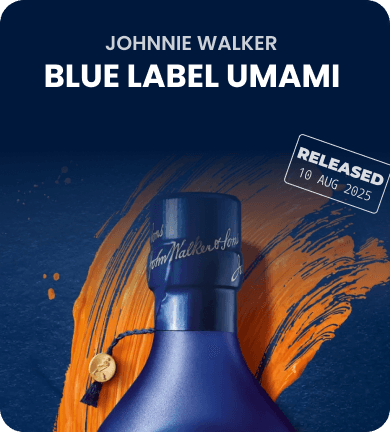
Rather than organize promotions as static category pages, I structured the feed around what had just launched, what was live, and what was coming next. Recent Drops, release dates, and countdowns created a clear rhythm, helping buyers quickly see what was new across brands.

06

The Template

One structure, with room for every brand

One structure, with room for every brand

One structure, with room for every brand

Each Drop followed a shared content structure that could support product details, tasting notes, recipes, and campaign assets. The underlying experience stayed consistent, while color, typography, imagery, and individual modules could adapt to each brand.

This made the system repeatable without making every launch feel the same.

07

The Handoff

Designed to keep launching without us

Designed to keep launching without us

Because my design manager and I would not produce every future page, we worked alongside marketing to build a framework they could continue using. We approached the handoff as part of the design process, creating a repeatable structure that could support new products, content, and brand identities.

That collaboration gave marketing context for the design decisions and a foundation for creating future Drops. The goal was to make each launch feel distinct while keeping the core experience consistent, without needing to redesign the page every time.